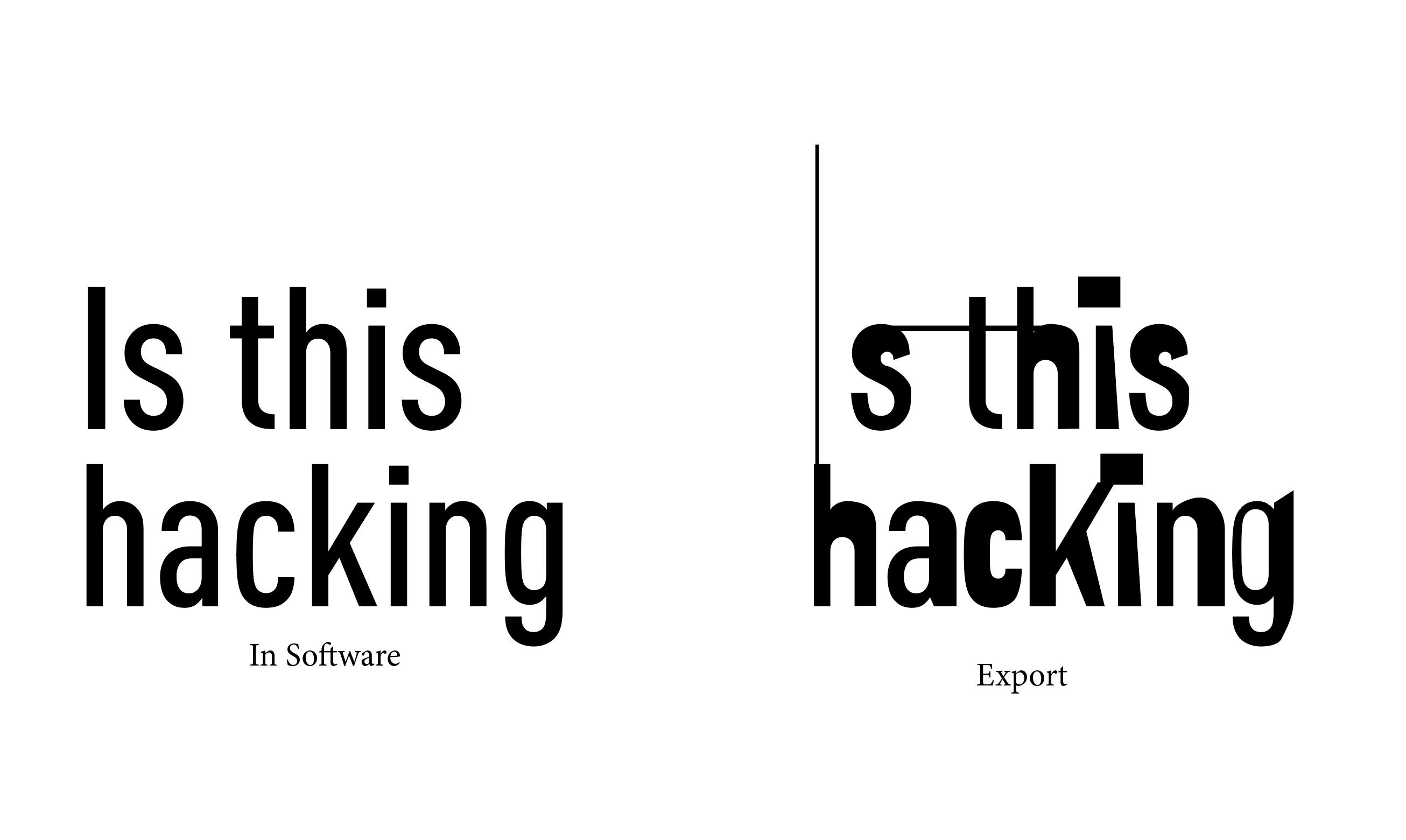
I tried to make a font that looks "normal" on screen but
changes after export when printed — a small act of misbehaving type.
It didn’t work as planned. Turns out, fonts are deeply conservative technologies designed for stability (no surprise). This process exposed the limits of authorship in typography: I could design an alternative behavior, but I couldn’t control when (or if) it would appear. Ironically, the only way to make the effect visible was to manually intervene.
The Image below shows the idea.
This felt like a waste of time and was very frustrating. However, I experienced a moment of joy while I was attacking the DIN typeface.
| What | Layout, Text hierarchy |
|---|---|
| Sources | DINPro Font (Medium Condensed) |
| Tools | I tried FontForge and Glyphs; Word, InDesign, TextEdit – to test behavior across software; PDF export, Print Preview – to observe visual changes |
| What I tried | Created .calt alternates for all letters (a.calt, b.calt, etc.) Wrote OpenType substitution rules (sub a by a.calt, etc.) Also tried contextual substitution (sub a' b by a.calt;) Attempted feature switching using: ss01 and calt |
| Output | Din Unprofessional (Fontfile with distorted Glyphs) |